Accessibility Is Product Quality


Accessibility used to sit in the corner of product conversations like a compliance checklist nobody wanted ownership of. That has changed. Not because companies suddenly became altruistic. Mostly because inaccessible products are expensive, fragile, frustrating to use, and increasingly visible. Teams are finally connecting accessibility problems to churn, poor onboarding, weak SEO, support tickets, abandoned forms, and lower conversion. The uncomfortable truth is that many accessibility issues are not edge cases. They are just bad UX that impacts everyone eventually. Tiny tap targets on mobile. Weak contrast in dark mode. Over-animated dashboards. Forms that wipe validation errors after refresh. Keyboard traps in modals. AI chat interfaces that cannot be navigated with assistive tech. These are product quality issues. The companies building the best digital experiences in 2026 are not treating accessibility as a final QA step. They are building accessibility into systems, workflows, design decisions, component libraries, and product strategy from the start. That does not mean every startup needs a perfect WCAG score before launch. It means teams need to stop thinking accessibility only matters when lawyers get involved.
Accessibility Beyond Compliance
Most conversations about accessibility still start with WCAG. That makes sense. WCAG provides an important framework for accessible web design and accessibility in app development. But treating accessibility purely as compliance creates shallow products. You can technically pass audits while still delivering an exhausting user experience. A SaaS dashboard might meet contrast ratios yet overwhelm users cognitively. A fintech onboarding flow may support screen readers but still confuse users with overly complex language. A low-code platform may expose semantic HTML while generating bloated interfaces impossible to navigate efficiently. Real accessibility work starts when teams ask: Can people complete tasks confidently? Can users recover from mistakes? Does the interface reduce mental load? Is the product resilient under stress? Does the experience work in imperfect environments? Accessibility-first product design is really about designing for human variability. People use products one-handed on trains. With cracked screens. In bright sunlight. While sleep deprived. Using voice control. With temporary injuries. On poor internet connections. With neurodivergent processing patterns. While juggling five browser tabs and a Slack call. The best accessible SaaS platforms and mobile apps acknowledge reality instead of designing for ideal conditions.
Inclusive UX Patterns That Actually Work
A lot of inclusive UX advice online still feels disconnected from real products. You will see generic guidance like “make buttons bigger” or “use alt text”. Important, yes. But modern product accessibility is increasingly about interaction patterns. For example, progressive disclosure has become one of the most effective accessibility tools in complex interfaces. Instead of presenting users with dense financial dashboards, advanced filtering systems, or overloaded CMS controls all at once, strong products reveal complexity gradually. This helps: Users with cognitive impairments First-time users Older users Stressed users Mobile users Power users navigating quickly The interesting part is that it also improves conversion. Many fintech and SaaS products discovered that simplifying onboarding flows increased completion rates while simultaneously improving accessibility. Another strong pattern is persistent orientation. Users should always know: Where they are What changed What happens next How to undo actions This matters enormously in AI-powered interfaces. AI products often generate dynamic content updates, streaming responses, or auto-changing UI states that create chaos for assistive technologies and cognitive accessibility. A flashy AI interface that constantly rearranges layout elements is not innovative. It is exhausting.
Dark Mode Is Still Done Poorly
Dark mode accessibility is one of the biggest areas where aesthetics still dominate usability. A surprising number of apps continue using low-contrast grey-on-grey palettes that look beautiful in Dribbble shots and terrible in real usage. Pure black interfaces are not automatically accessible either. In fact, harsh black backgrounds paired with bright white text can create eye strain and halation effects for many users. The strongest dark mode systems now use softer contrast balancing. Good accessible dark themes typically: Avoid absolute black and pure white Use layered elevation cues Preserve focus visibility Differentiate interactive states clearly Support colour blindness Maintain readability outdoors One major issue in accessibility audits is teams testing dark mode only visually. Accessibility in UI/UX design requires interaction testing too: Does keyboard focus remain visible? Do validation states remain distinguishable? Can charts still communicate meaning without colour? Can disabled states still be understood? Dark mode failures often appear most aggressively inside data-heavy SaaS products, low-code builders, analytics tools, and trading platforms. The irony is that these are the products most likely to attract users spending long periods inside interfaces.
Motion, Animation, and Cognitive Load
Animation accessibility has matured significantly. Five years ago, the conversation focused heavily on seizure triggers and reduced motion settings. That still matters. But modern accessibility discussions now focus far more on cognitive fatigue. Many interfaces are simply too busy. Microinteractions became trendy. Then every button bounced, every card floated, every panel faded, every graph animated, and every AI assistant streamed character-by-character responses. Movement should support comprehension. If motion exists only to make a UI feel “premium”, it often becomes noise. Some of the best accessible mobile apps now use motion strategically: Reinforcing hierarchy Guiding attention Confirming actions Preserving spatial orientation Improving perceived performance Not every transition needs animation. And not every animation needs duration. Reducing motion settings should not completely break the experience either. Many products still disable important contextual transitions entirely instead of providing simplified alternatives.
AI and Accessibility Are Colliding Fast
AI interfaces are exposing accessibility weaknesses across the industry. A huge number of AI-powered apps are currently inaccessible. Partly because teams are shipping quickly. Partly because conversational interfaces create new UX challenges. Screen reader support inside streaming chat interfaces is still inconsistent across many products. Auto-scrolling conversations frequently steal focus. Voice interfaces often fail users with speech impairments. AI-generated summaries sometimes oversimplify information in ways that reduce comprehension. There is also a growing issue around AI hallucinations and accessibility. If a user relies heavily on simplified summaries, voice output, or AI-assisted workflows, misinformation becomes an accessibility problem too. Trust and clarity matter. The most forward-thinking teams are now designing AI interfaces with: Controllable pacing Structured outputs Predictable navigation Accessible chat histories Editable AI responses Clear confidence indicators Multimodal interactions Accessibility in AI products is not just about assistive technology compatibility. It is about giving users control.
Accessibility in Low-Code and No-Code Products
Low-code and no-code platforms have opened digital product creation to far more people. That is a good thing. But they have also created a massive wave of inaccessible interfaces. Many no-code tools encourage visually-driven building without teaching accessible structure. Common issues include: Missing semantic hierarchy Inaccessible modals Poor tab order Unlabelled form fields Bloated DOM structures Inaccessible drag-and-drop interactions Performance-heavy component stacks The problem is not low-code itself. The problem is abstraction. When teams cannot see underlying structure, accessibility debt grows quietly. This becomes especially dangerous when businesses scale MVPs into production products without revisiting architecture. We increasingly see startups launching successful MVPs that later require expensive accessibility audits and rebuilds because foundational patterns were never designed properly. Accessibility debt works similarly to technical debt. The longer it sits, the harder it becomes to untangle.
MVPs Do Not Need Perfection
There is an important nuance here. Not every MVP needs enterprise-level accessibility maturity immediately. A startup validating product-market fit should prioritise learning speed. But accessibility still matters during MVP development because inaccessible assumptions become embedded quickly. The goal is not perfection. The goal is preventing structural problems. Teams should focus early on: Semantic foundations Keyboard support Scalable component systems Readable typography Sensible contrast Accessible forms Predictable navigation These decisions compound positively. Retrofitting accessibility later into unstable design systems, rushed APIs, or fragmented frontend architectures is significantly more expensive. Especially in mobile apps.
Keyboard Navigation Is Still Shockingly Neglected
You can learn a lot about a product by unplugging your mouse. Keyboard navigation remains one of the fastest ways to expose weak UX. Many otherwise polished platforms completely fail basic navigation tests. Focus states disappear. Dropdowns trap users. Escape keys do nothing. Modals cannot be exited. Sticky headers interrupt tab order. Complex tables become impossible to navigate. Ironically, strong keyboard accessibility often improves productivity for all users. Power users love efficient navigation. Accessible SaaS platforms increasingly support: Command menus Keyboard shortcuts Skip links Focus management Predictable interaction patterns
Related Insights

·
3 min read
Why AI Agents Fail Without Product Structure

·
5 min read
Good UX is System Design, Not Interface Design

·
3 min read
No-Code Works… Until Systems Start to Scale

·
3 min read
Cybersecurity Is No Longer Just an IT Problem

·
7 min read
AI Is Becoming The Expensive Option

·
8 min read
UX for Legal Claim Funnels

·
3 min read
Serverless Architecture on AWS is a Key Differentiator
·
3 min read
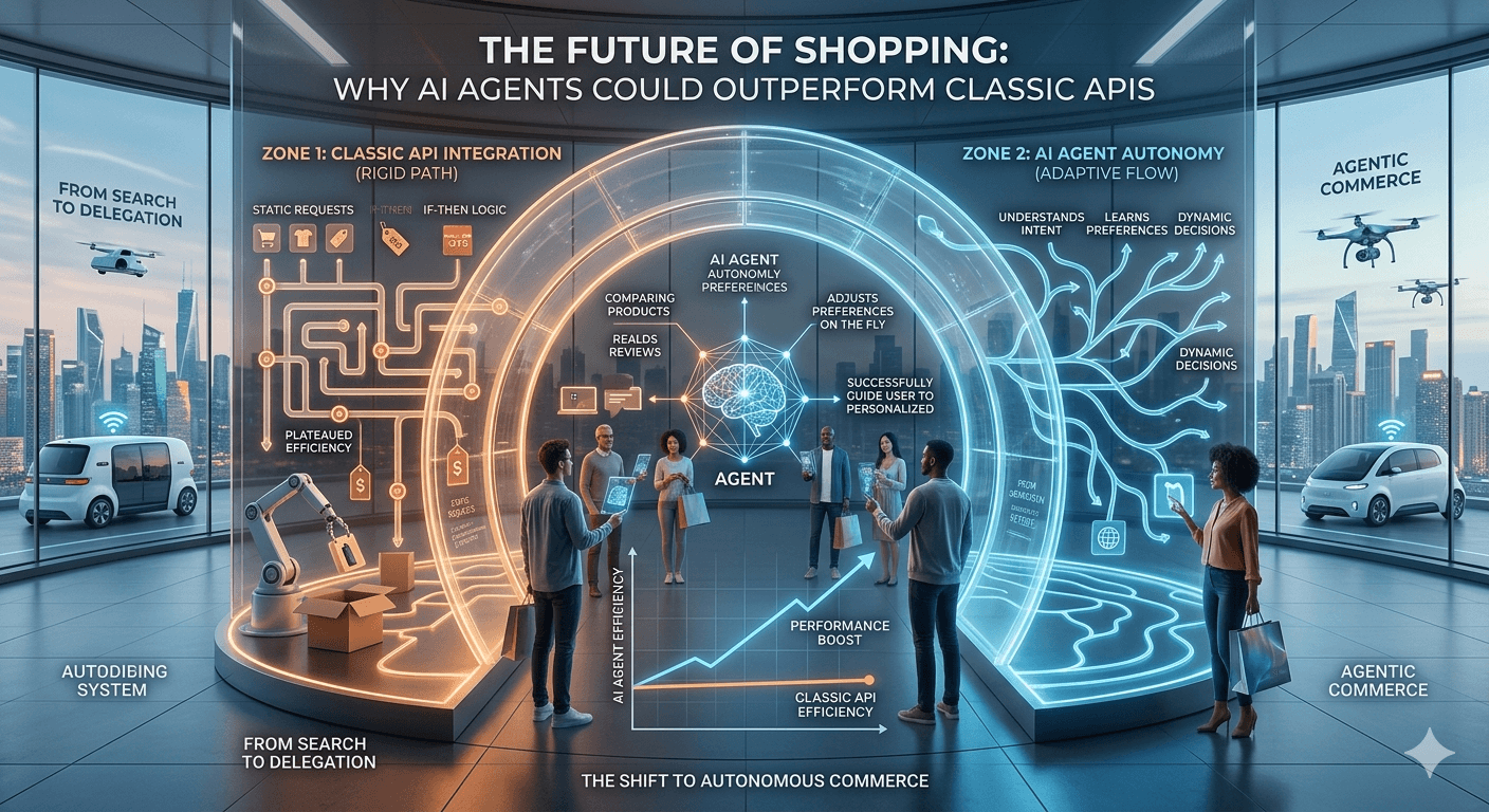
Why AI Agents Could Outperform Classic APIs
·
3 min read
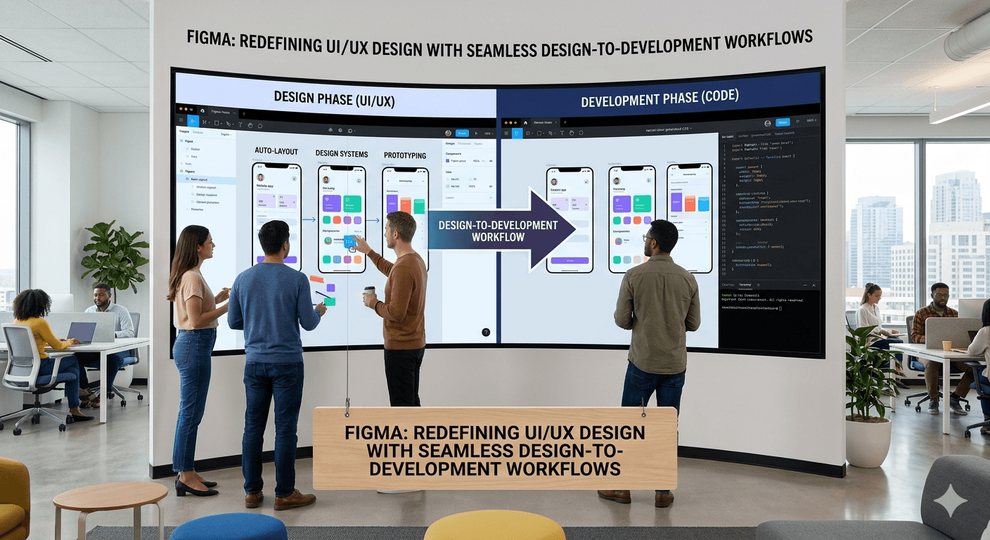
Redefining UI/UX Design Seamlessly
·
3 min read
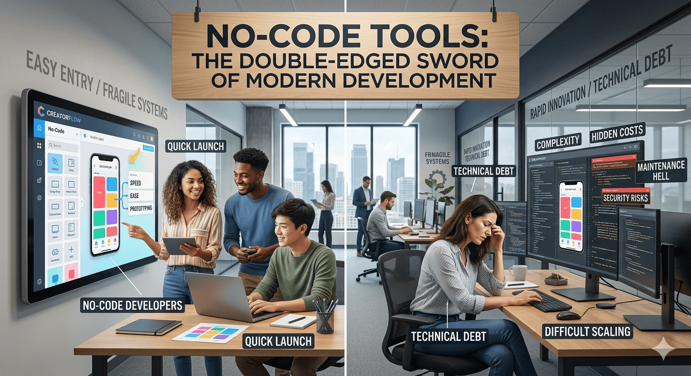
No-Code Tools: The Double-Edged Sword of Modern Development

·
3 min read
Claude Rides on SpaceX’s Cloud Infrastructure